


Are We There Yet? A Cautiously Bullish Tone Sneaks into the Market.
A bullish chart pattern develops in the Nasdaq 100. Plus two sectors that account for 25% of GDP are worth a look.


Image courtesy of trading-education.com
Trading is a tough business, and last week proved it. Yet a deep dive into the price charts suggests that the post tariff “pause” rally may be gathering some support, although the market remains vulnerable to the effect of the news cycle and there are plenty of potential pitfalls lurking.
There’s a lot of disbelief in the markets these days, which is traditionally a bullish development from a contrarian standpoint. In a recent post, I suggested that something spectacular maybe on its way to the stock market. And Friday’s turnaround may be the start. But by Friday, a small, yet hopeful trading pattern emerged. I describe it fully in the NYAD section as it pertains to the Nasdaq 100 Index (NDX). Bearish sentiment remains at near record levels, and other traditional intermarket relationships are stretched. Is this time different? Let’s see what happens next.
So, while last week was different than anything we’ve seen recently, as volatility replaced traditional support and resistance as the measuring stick for value, the market’s gyrations may have shaken the final sellers out. This comes in the face of tighter liquidity as the National Financial Conditions Index (NFCI) is well above its January lows, prompting JP Morgan (the Fed’s primary client) to complain about tighter liquidity, and at least one Fed bank president suggesting the Fed is ready to step in if things get worse.
It’s All About Liquidity
Liquidity remains tight, which partially explains the stock market’s wild swings. The latest reading, April 4, 2025, of the Fed’s National Financial Conditions Index (NFCI) at -0.54, shows the index continuing its recent climb from the recent lows at -0.67. Negative numbers signify ample liquidity. Yet, the nearly 10-plus basis point rise over four weeks is cautionary and at least partially explains the general weakness in stocks.
Everybody’s bearish. Everything is oversold. The hard data is stable; and in some cases, has become encouraging (the rate of inflation in both CPI and PPI – is slowing, the budget deficit for March fell, breaking a string of big increases, and last week Treasury bond auctions went well). Yet, liquidity worries are brewing, and you can see it in the bond market.
All of which brings us to the first sign that the Fed is ready to switch gears as Boston Fed President Collins, in an interview, suggested the Fed would be “prepared” to ease conditions if financial markets became “disorderly.” Yikes! What’s the Fed’s definition of “disorderly.”
Sentiment Summary – Panic Gives Way to Relief
• The CNN Greed/Fear Index (GFI) hit a low of 4 last week, closing at 13. This remains a bullish Extreme Fear Reading.
• The Composite Put/Call Ratio rose as high as 1.25 on a closing basis last week but closed the week at 0.78 a sign that bearish sentiment is waning. The index P/C ratio was as high as 1.40 last week but closed the week at 0.99, a more neutral reading.
• The CBOE Volatility Index (VIX) closed near 38 after rising above 50 last week.
• The S&P 500 (SPX) fell as low as four standard deviations below its 200-day moving average (see below for an update and this post for full details as it happened).
• The bond market is selling off raising yields.
Bollinger Bands are the New Support and Resistance Levels. 2SD Line Holds.
You know things are different when VBP bars, trend lines, and moving averages are replaced by Bollinger Bands as the market’s go to support and resistance levels. That’s because Bollinger Bands measure volatility while support and resistance levels measure price areas where price trends often reverse or break down further. In other words, last week prices became secondary to volatility as the value barometer.
Last week I noted that the decline had tagged the lower Bollinger Band corresponding to 3 standard deviations (3SD) below the 200-day moving average (pink lower line). So, we thought we had seen everything given the occurrence of that 3-sigma event. But guess what? We then saw a four Sigma event on 4/8/25. This was the first such occurrence since March 2020 when the pandemic bear market reversed in response to the Fed’s massive QE.
The net effect is that the S&P 500 (SPX) and the relationship of its price with its 200-day moving average, and multiple levels of Bollinger Bands (2SD, 3SD, and recently 4SD) have become the go to levels for price discovery.
The way these indicators work, is that when prices touch or break above the upper band, or touch or fall below the lower band, it’s a signal that a reversal is near. The reversal may be to a short/intermediate term support/resistance level such as the 50-day moving average, to a long term moving average, such as the 200-day, or in extreme cases to the opposite Bollinger Band or beyond that important level.

SPX came close to tagging, or breaking above the upper green band in July 2023, March, August, October, November and December of 2024. Each tag of the upper band led to a reversal, usually to the 50-day moving average. This testified to the strength of the bull market as the 50-day line proved to be an excellent place to buy the dip.
The pattern changed with the December 2025 tag of the upper BB. After that we saw a double top in February 2025 and the subsequent break below the 50-day moving average and the 200-day line.
Yet, by last week’s end SPX was trading inside the green band (2DS), which served as excellent support for the third day running. This move back inside the 2SD lower band, although still reversible, was a solid positive, confirming the 2SD line as an important support level.
Bond Yields Threaten Upside Breakout. Is it a Bullish Sign?
The bond market reversed course last week, ignoring encouraging readings of CPI and PPI, as rumors floated that China is selling bonds to respond to U.S. sanctions. If true, then things just got interesting as an alternative vibe is emerging; and rising yields may signal the bond market’s sigh of relief about the economy falling into recession.

The U.S. Ten Year Note yield (TNX) broke above 4.5% and is now reaching an overbought level (RSI near 70), which suggests that a short term top may be close.
Long Term Investors Nibble at Oversold Sectors Accounting for 25% of GDP

I am watching the relationship between bond yields and the iShares U.S. Home Construction ETF (ITB) closely as the sector is a bellwether for the economy (housing is 16% of GDP) and the action in homebuilders often precedes turns in the economy. Certainly, it’s going to take patience, yet there is value in this sector and I’ve been nibbling at the homebuilder stocks for the past several weeks. Get the details at the Weekender Portfolio.

A similar pattern is emerging in the VanEck Vectors Semiconductor ETF (SMH), which accounts for 9% of GDP, where the ADI line is bottoming out (short sellers getting out of positions) and the OBV line (buyers nibbling) is starting to make higher lows and higher highs. I’ve recently recommended some exposure to the semiconductor sector in the Sector Selector portfolio.
For ideas on the homebuilder stocks check out the ESP Portfolio, and the Weekender Portfolio (links below).
If you’re an ETF trader, consider, Joe Duarte’s Sector Selector. It’s FREE with your monthly membership to Buy Me a Coffee. If you’ve been thinking about starting a day trading career, my new book “Day Trading 101” will get you started on the right foot. For steady gainers, check out the Smart Money Weekender Portfolio. I’ve just added several new positions in this weekend’s edition. Trade better with extra energy, and vitality. Visit my Health Products Page.

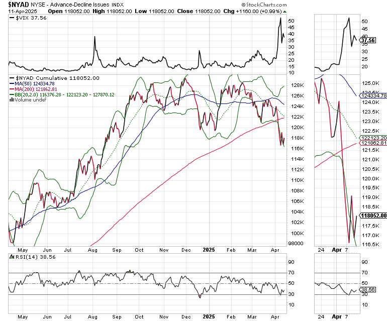
NYAD and Major Indexes Reverse Course.
The New York Stock Exchange Advance Decline line (NYAD) recovered, bouncing back inside its lower Bollinger Band after the RSI hit the 30 level. The 200-day moving average will be the first major resistance test.
The Nasdaq 100 Index (NDX) has bounced back after falling to its September 2024 lows. Short term resistance is at the 20-day moving average. Yet, the ADI and OBV lines are rising as money moves in. And Friday’s close delivered a bullish engulfing pattern at the close. A move above 20,250, if it holds, would signal a return to a more sustainable uptrend.

The S&P 500 (SPX) is discussed above.
VIX Hits 50-Plus then Retreats
The CBOE Volatility Index (VIX) topped out above 50 last week hinting at a climactic selling panic. By week’s end it had retreated below 40 while remaining at cautionary levels.
VIX rises when traders buy large volumes of put options. Rising put option volume leads market makers to sell stock index futures to hedge their risk and leads markets lower. A fall in VIX is bullish signaling lower put option volume, eventually leads to call buying which is bullish as it causes market makers to buy stock index futures raising the odds of higher stock prices.
To get the latest up to date information on options trading, check out “Options Trading for Dummies”, now in its 4th Edition – Available Now!

#1 Best Seller in Options Trading –
Now in Audible Audiobook Format
Options Trading for Dummies (4th Edition) Audible Audiobook – Unabridged
Joe Duarte MD (Author), Terrence Kidd (Narrator), Tantor Audio (Publisher)
Thank you Joe for explaining the method of price discovery combining moving averages, and multiple levels of Bollinger Bands. I haven't understood standard deviation as well as I shoud since my survey research days - time to brush up. So we can say a 3SD is a 3Sigma event? PS You got a little ahead of yourself with "The pattern changed with the December 2025 tag of the upper BB" typo :)